
Monday, December 26, 2011
A New Series
Monday, December 19, 2011
Hotels
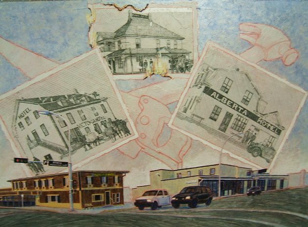
Architecture is not my favorite subject. Everything has to line up just so and follow the rules of perspective. It is very time consuming. With the deadline looming I was wondering if I had chosen too long a process when I had decided to transfer the photo images. I took the original photographs and I enlarged them on a photocopy machine. One was just large enough. The other two needed to grow by using the grid system. I could not find my plastic sheet with the grid but in my search I found a forgotten piece of plexiglass which I quickly gridded up and threw the maquette under it. The enlarged photocopies went under the grid as well and I was soon satisfied with the shell of each structure. My light table is very useful at times. I turned it on and stood on the stool. Too short. The only horizontal surface in my studio that can accommodate the light table is about five feet up. The one foot stool got my head just over the rim…. Out came the two step stool. Just right. All I had to remember was not to step off of it thinking it was the floor… Once the shells were traced on the back of each sheet (the images were going to be reversed in the transfer so this was a necessary step) I began to add the details freehand. I stopped in and had a photocopy made of each drawing before I went back to my studio and then pasted them to the surface of the vignette. As I waited for that to dry I began to labour over the other structures at the bottom of the piece. I took a break and added the sky. This was going to work! The next day I scrubbed off the paper, touched up the drawings, finished the lay in and began to paint the bottom. One more day. Yes, I was going to meet the deadline. I like being on time. I like it when my customers are pleased too. All in all this was a very satisfying challenge.
Tuesday, December 13, 2011
The Third Vignette

I knew I was supposed to do something last night. I have this habit of keeping a daytimer which is quite detailed and accurate. There is another habit I will develop to make it effective….I will read it! Our routine is a little disrupted again. I came home to a dark apartment. Martin is gone to a funeral. My daughter suggested a movie after supper. I am addicted, I admit. Then I finished a sudoku…. Well, I am feeling great this morning and anxious to get into my studio. I plan on driving as the sun comes up. It is so beautiful in the morning. I hope to get most of the painting done today. What you see is the third small panel, about three feet by four feet. I know it does not look very close to finished but, hey, the deadline is Thursday. The white squares are transfers. I took quite a while to do the drawing on the buildings and I was impatient to see how it would look so I took the first layer of paper off the top rectangle. It just needs a little scrubbing. Much to my surprise a cheap plastic scrubber, one that can be purchased at any supermarket, is the perfect tool to lift the paper residue…. And what is a transfer? Trade secret! Not really. I do not believe in secrets. There are several ways to do a transfer. My preferred method involves drawing in the dimension I wish to place on the panel or the canvas then having a photocopy made. Usually the drawing is too large for ordinary copy machines and it needs a blueprint copier instead. The paper is thinner, so much the better. I put a layer of gel medium on the surface of the panel and carefully place the copy with the print down on the surface. Using a rag I press out the extra gel and remove the inevitable wrinkles. Leaving it usually overnight, I wet the surface in the morning and gently scrape the excess paper off with my fingernails, finishing with a scrubber. Fun!
Tuesday, December 6, 2011
Time to March

Here it is Tuesday evening and I have a definite intuition that it is still Monday. My husband assures me that my notion is erroneous. I am very thankful that when I pulled up the blog site I had installed a photo at least. I know what to talk about it! This is the second of three panels I am painting for Morinville’s St. Jean Baptiste Park. Parades. I had no idea how many different parades they could be. I have led a sheltered life…. The one that interested me most was the oldest. At one time there used to be a procession from the church, through the streets with stops at each house that had requested a blessing. Lots of kneeling, lots of prayer. As we move closer to our era there is less about prayer and more about food, finishing with a pancake breakfast. Lots of fun and sometimes lots of indigestion. I had completely forgotten to sign my work as I slapped on the varnish. Leaving one small corner for the finishing touch I walked away to let paint dry. I have learned, the hard way, that it is best not to rush things. Varnish has a tendency to take metallic and felt pen off. It needs to be protected by a coat of gel medium and gel medium removes writing too if it is not allowed enough time to stabilize or it is rubbed to vigorously. Everything in its own good time
Monday, November 28, 2011
Contribution

It is busy these days. My deadlines are looming and there seems less time than usual to get everything done. Busyness. It is time to reconsider. This is the first week of Advent, time to pause and make room at the inn for peace, hospitality and joy. I will take some time today to sit, or, even better, to walk. A little exercise clears the mind. In the meantime there is one out of three projects done for Wednesday. Two panels are due, one on the contribution of two extraordinary people in the medical field and another on celebration in the form of parades and processions, plus a maquette for a third panel on local hospitality establishments, the hotels. A maquette is a sketch illustrating preliminary ideas made for approval of the concept before the painting is done. I have found that the more complete a maquette image is, the easier it is for my client to decide whether or not he/she approves of it. The three panels are destined for the St. Jean Baptiste Park in Morinville. It is a lovely park and the installation of the murals and panels is very pretty. This is the medical themed image. It is less complex than the parades and portraits are always fun. Of course the ease of the project depends on the clarity of the source photos which is not always the case. I am usually very thankful for the hours I spend drawing from life. It is amazing what can be fixed with a little knowledge and experience.
Monday, November 21, 2011
Sticks and Links

Monday, November 14, 2011
Vignettes


It is true. There are no vines running through the images nor is there much shading. Some would call the collection of images charming, one of the qualities of a vignette so the dictionary says. Why vignette? Well, it is a convenient way to differentiate between sizes of murals. A vignette in my corner of the world is a three foot by four foot panel which will be mounted in a steel frame set beside a path in a park. A tableau is a four foot by eight foot panel and a mural is any size after that. So these are two of the three vignettes that I have been commissioned to paint. I prepared the panels as usual with molding paste and several coats of iridescent colour. The base is the same for all three: ultramarine blue and burnt sienna with a touch of silver. A little alizarin crimson adds a further dimension. I chose a purple watercolour pencil to do the drawing on the medical image. Purple is the colour of healing they say. My favorite poppy red watercolour pencil delineated the collection of parades, a complicated piece. Parades are lively, red is lively. Now all that is left to do is paint.
Monday, November 7, 2011
My world

Tuesday, November 1, 2011
Finishing Touches


Obviously the white hand had to go. The white bridge was a little shaky too. I picked up the paint brush in my left hand again. I am not really left handed. The left hand fit in the picture. We artists make all kinds of sacrifices and use all manner of lies to create the illusion. Truth is expendable in painting. Purple people come into existence at the flick of a brush. Anyway, to get back to my left hand, I could see that the quick block in that I had previously made was somewhat inaccurate. The fingers did not quite work… That kind of truth is not expendable. So taking my other hand, a brush and a little gesso I adjusted the drawing to suit the circumstance. I considered the colour. The underpainting had been a pale green. I wondered what I could get away with. A green hand would work if I were careful about the rendering. Green is also part of the colour of flesh. The first layer was burnt sienna followed by yellow ochre and a touch of alizarin crimson with a dash of ultramarine blue. Yes, quite satisfying. I took out the phthalo green and brushed over the back of the hand and grazed a few other spots in the shadow areas. Just the ticket. Now for the bridge. It needed some understructure and a few fine negative spaces. Much better. As a finishing touch I wrote a poem, bilingually as usual, and enhanced the needles of the pine tree in the foreground. Perfect. All that is left is a protective overcoat and my signature…. Not in that order of course.
Monday, October 24, 2011
Blocking In

I considered using paint. I did use some coloured gesso to solidify some areas; it looks pure white but it isn’t. Then I decided I would block in with tissue paper. I have a lovely variety of colours and tonal values in the same colour combinations that Lewis used in his under painting. The challenge came in adjusting the image I had chosen with the tonal values already present. The bridge spanned some water. In the photo some of the water was light but very little, certainly not enough to respect the lighter areas laid down in the under painting. So…. I jumped into being artist, took control of the image and changed things. It just has to be believable that is all. I wanted to relate the sky to the water and the sunlit patches on the trunk of the tree to the right. Out came the gold. Real gold. So much fun. So, the blocking in is finished, the gold has been carefully positioned. Now, what has to be adjusted to relate to the original colours and tonal values so that the panels around me relate? That requires an image of the original panel…. Did I keep that? Thank God for computers!
Monday, October 17, 2011
Light and Negative Space


Quite a while back the St. Albert Painters’ Guild was searching for some images that we could use as a base for a collective interpretation. Everyone would have the same photo from which to work in their own style and media. I spent a few minutes wandering the parks of St. Albert one late afternoon, looking for those magic shots where light and negative space collaborated to form perfect compositions. I submitted my photos and someone else’s image was chosen. I was left with a file of beautiful inspirations for another day. The thought crossed my mind that one of those shots in particular would be excellent for my #53 panel. I hesitated. Chaos is still my middle name these days. Where might have I placed those printouts? This was to be another lesson for me in my faith journey. When my intention is clear the universe conspires to contribute to my success. I walked over to my cutting board, moved a couple of piles and voila! There it was. Considering my main colour palette to be gold and purple I chose an aubergine watercolour pencil and manipulated the image into the set parameters of value and colour. Next step: paint and perhaps a little real gold. Tissue paper? Mmmm…. Anything is possible as this piece will not be attached to an outside wall but rather archived for future generations. Love it!
Tuesday, October 11, 2011
Beginnings

Tuesday, October 4, 2011
Celebration: 150

I am so getting better at ‘en plein air’. I am discovering what really fascinates me: the play of light and how that works with negative space. I also discovered, with this particular painting, why photographs just do not cut it. I had not quite finished the bottom of the piece when I snapped a photo and brought it home after a long day of painting under the willow tree. I had been very thankful for that willow tree. The sun shone all day and it was hot. In the shade not only was I protected but the sunlight did not pounce off the surface of the paper and distort the colours I was using. I had stood for sometime gazing at the river and its surroundings before I decided what had attracted me to the scene besides the shade... I love the spaces between the blades of grass. I love the challenge to simplify, a necessary step because there are always too many blades of grass. I gazed at the background and decided what I was going to eliminate while keeping the illusion that I had eliminated nothing…. Fun! First I took a poppy red watercolour pencil and began to record the large spaces from the background enjoying the increasing difficulty of deciding which negative space to include. Carefully rendering the background without a lot of detail I came to the fun part of painting the water reflections within the negative spaces while at the same time keeping the tonal values and colour consistent with the surrounding landscape. Then, with the bottom I began to slap in some curvy strokes emulating the shaded grassy areas. I was tired so I packed up and went home. I had enough information to complete the painting at home. I printed off a copy of the photo I had taken and compared notes. Wow! The exuberance of the shaded strokes could not be seen in the photo. I continued with the same strokes, relying on memory, and left a little grass in the sunlight at the bottom. Standing back I decided that the patch of light at the bottom needed to disappear. It was distracting. Once I had finished covering the paper with darkish paint I moving into darker paint and created the negative patterns between the blades. A few more touches and voila! How I love my job!
Monday, September 26, 2011
Even the Dead

Monday, September 19, 2011
Chaos reigns

 Sometimes I wonder how I manage to get things done. I am thankful my studio is still functional, well, now it is. As you can see something of a tornado hit it recently. It has been quite an upheaval. We were just in the process of moving our son to Manitoba when we rented the house with a deadline of ten days. Since we were gone for three of those days it left us one week to pack and move. Again, thankfully not everything had to be moved. We stored most of the furniture in two unused bedrooms downstairs, threw everything that was not necessary in the garage (my studio) and moved the rest into a condo in the city. Yes, we are sharing our daughter’s accommodation and I am commuting to work… well, once things are under control again. I have actually spent two days in my studio since the move, things are put away and projects are started. Small projects. I just cannot seem to focus lately. Could have something to do with exhaustion. Maybe. I will begin to focus shortly as I have five shows coming up before January. The first two are almost taken care of, just about. I will turn my attention to the invitations now. See you later!
Friday, September 16, 2011
Almost Done

It is fortunate that I completed this mural in a timely fashion. I could not have predicted the changes in my world one week could make. Yes. The mural is done; I am not sure when it will be installed, but it is done. The very same day I completed it (Monday) our son announced that had had landed a job in northern Manitoba, a mere thousand kilometers away. He was due to start the following Monday. The day we left for The Pas we made a verbal agreement to rent our house to a young family; we were to be out of the house by the following Friday. So, where does that leave me? Looking for a studio. Again. We have a place to live in Edmonton. We will store our furniture as the condo is too small to accommodate what we have. In the interim we hope to sell and buy a home closer to our centers of interest. It has been in the works for some time. Life is such an adventure. We cannot always predict the twists and turns. Well, I have things to organize. It is a blessing that I am good at it!
Monday, September 5, 2011
Undercoat

To begin with I had committed to a monochrome layout for all the four sections of the mural behind the logos. It bothered me that it appeared so dull. The colour just was not lively enough; the darkest darks were not dark enough. What to do? I decided to use a complementary colour for the undercoat. Burnt orange is my latest favorite. When mixed with cobalt blue it makes the most luscious grays, but did I want gray? Not exactly. I wanted the burnt orange to show through after I applied the cobalt on top. In order to get gray the applications would both need to be about the same amount, the more opaque the application the darker it would be right down to black. So the next question is where are my darkest darks? I took the jar of pure burnt orange and proceeded to fill in the areas where I know I would later add the purest blue. For a less intense dark, I took out my bowls of prepared pigment mixed with gel medium. There are two different consistencies: one paler than the other, one sparkling with iridescence and one not. I like my paintings to glow. Brushstrokes became important again. I chose a random, vigorous stroke for the trees and bushes, a vertical one for the grass, another one for the flesh tones and I liked the peach colour I produced. I decided to leave more of the burnt orange showing than I had previously anticipated. I wonder what my customer will think of it. We’ll see.
Monday, August 22, 2011
Halfway

Following one more critical assessment it is time to separate the sheets that I have painted and remove the first panel so the last one may be set in place and the drawing completed. Having had the experience of ripping pieces by accident in previous undertakings I move more cautiously carefully easing the edges apart. The acrylic paint makes a good glue. I had used a little sticky putty to hold the pieces together. Some of these had received a coat of paint too. Eventually I laid the first panel on the table and went about removing the residue before rolling it up. Stored until the installation day. It takes considerable patience to move and realign the drawing on each panel. I added more clips just to be sure my new arrangement would not move. As I attempted to install the last panel I saw that the grid did not allow for enough overlap, the eight inches are about right to accommodate the irregular edge once it has been cut. I took the panel down and laid it on the table with the intention of redrawing the grid. Once on the table I noticed that I had been lining the other panel up against the wrong marks. I had to laugh. Back up the ladder and the job was done. I stepped back to admire my work. Then it occurred to me. Another occasion for laughter. I had been so proud of my overlap solution. I had even thought of a way to avoid the underlay straight edge which will inevitably show up once the pieces are glued to the wall of the building. There was only one thing I had forgotten….there are horizontal cuts as well. There is no overlap on those…. I am sure there is a solution… there always is.
Monday, August 15, 2011
Slippage


This would not happen using four by eight foot sheets of plywood. I still prefer the fabric. The mural I am working on presently is too large for my support structure so I am doing it in sections. This takes a little planning. I have four of the five panels hanging at the moment. I have finished the gridding and established the center of the piece. I completed the logos and drew the separations from the center to the corners on the left side of the mural. I so did not accurately calculate the time it would take to draw. I had not considered the precision required to copy logos, establish correct proportions and perspective on buildings and the chain link fence. Oh yes, there is only so much leeway that one can get away with on these items. And I forgot about the lettering on the signs posted on the fence….. Sigh. I tried to get away with more than I could on the chain links. In the end dissatisfaction drove me to do better and I now have something with which I am pleased. Integrity is time consuming too. The moment had arrived: I was to cut the adjoining edges. I had decided to do an experiment. The sheets of fabric overlap for about eight inches. This gives me plenty of room to remove the straight line edge following the drawing in order to hide the join. I began to cut the first panel and realized that I had been very fortunate in that the two panels had remained in place during the drawing phase. I was careful to line up the next two panels before cutting while I still had an edge to line up. That is when I noticed the slippage. How am I going to fix this? Well, that remains to be seen. I know one thing: I am not redrawing the logo! Once I have the two and half panels painted I will remove the first panel, move everything over and add the last panel, beginning with the drawing again. I think I will add more clips this time….
Monday, August 8, 2011
Less Traveled

I am back at it again. Lacey patterns created with negative space in between the stems and leaves of the grasses. The hayfever got to me. I chose to sound a retreat and set up my painting station on a small desk in the corner of my room at the retreat centre. It was sparce, the furnishings, but adequate. I had a bed, a desk and a sink with the window sill wide enough for storing small items like toothbrushes and cleaned paint brushes. I took another antihistamine and sat down. The hours passed quickly as I danced through each space dropping in various colours to create the variety so necessary in landscapes. Yet each negative space relates to another so they appear cohesive. I used a base colour of cobalt blue for the shadow areas and dropped in vermilion orange or burnt sienna, or cadmium yellow or yellow ochre and sometimes red. In the areas of sunlight I used a base of yellow ochre and reversed the process. It is fun watching the watercolour create the magic on the paper. With the en plein air paintings I do in watercolour I now use watercolour pencil to draw. Usually I select a colour complementary to the overall end result and since the forest is predominantly green my favorite drawing colour is red orange. It is in the drawing where I spend most of my time, that is, if I avoid the lacey. Lacey is time consuming and totally engaging. Once the drawing is complete I float base colours in a carefully painted area and drop in others on top watching the patterns form. Lots of fun.
Monday, August 1, 2011
Bastions

I am a rather outgoing, bubbly personality who, some say, likes to dominate the conversation… There were inferences taken when I told some friends that my husband had recommended to me a weeklong silent retreat in the foothills of Cochrane. I am thankful my husband and I usually understand each other and I took his suggestion to heart when I booked my week away last week. A week of silence sounded like just what I needed. It was just what I needed. I would recommend the very comfortable accommodations and grounds of Mount St. Frances Retreat Centre to anyone who wishes to reconnect, relax and reflect. The schedule of prayers, scripture meditation and meals gave some structure to the otherwise free time. I filled my hours with painting ‘en plein air’, reading, walking and just gazing out the window at the beautiful view. The property extends far enough so the invasion of dwellings will not interfere with the panorama of the distant mountains. The spruce and the Douglas fir, hundreds of feet tall, block the development to the north, some of which can be seen through the bastions of peace. My favorite refuge was along the trail in the woods. Some of the trail struggles between hedges of quack grass in bloom. Yes. I bought some more antihistamines and a box of tissues to complete my repertoire. Atchou!
Monday, July 18, 2011
Primer

Monday, July 11, 2011
Lac Bouchard

This is the second of two paintings done “en plein air”. I picked a wonderful evening. To begin with I wondered if I had left it too late. After all I set out at the nth hour of seven or as my husband prefers nineteen hundred hours. The sun sets at about nine thirty these days and it takes around an hour to get to where I was going. The other thing that bothered me was that I really did not know where I was headed. I remembered the general vicinity, a beautiful spot the children and I had discovered on a Sunday afternoon drive. I could not remember the name of the lake. I began making up excuses for not going such as I do not have the “right” equipment. Truly the task would be easier if I had a proper lightweight, ‘en plein air’ easel. Sigh. Choose and move. I set off with my cardboard box full of prepared panels, my less that efficient fold up easel, my oil paint box and a bucket with the extra things like a bottle of mineral spirits and rags in it. As I drove I passed the point where I thought the turnoff should be, again excuses bubbled up. “You missed it. Maybe you should just go home.” Of course being the stubborn… determined individual I am I continued down the road. I decided to relax and enjoy the ride. I turned off the road when the sign indicated Lac Bouchard Lake. I did remember that the trail continued out onto a sandy spit so I did not stop at the upper campsite and ventured as far as the spot where the four by fours evidently had trouble getting in and out. OK. I have a 1995 Neon. Not the same thing. I would walk from here. Being present opens a world of wonder. I was serenaded by a lovely chorus of frogs to the south and a profusion of birds all around. The light softened into liquid gold. Awestruck I almost forgot to paint.
Monday, July 4, 2011
Multitasking

Tuesday, June 28, 2011
More to Come

Maybe I should be a bit taller…. One of the hazards of working outdoors is miscommunication! Someone took the scaffolding away too soon. And I am a little short. Nevertheless the job will be done and done on time. There is quite a process to installing a mural. Once the mural is painted the work is far from done. Depending on what materials are used to support the image installation can be a costly and lengthy process. In this case it is relatively inexpensive. The fabric on which I painted the mural molds easily to uneven surfaces, such as stucco. Using regular gel medium gloss we put a coat on the wall while another team of two put a layer of regular gel medium matt on the mural panel. We had indicated on the wall the shape of the piece to be installed before applying the gel. The edges are the most important. Water is the enemy and must be excluded. As the gel dries quite quickly the least time separating the coming together of the two gel coats the better. Time is of the essence. That is one of the reasons the pieces cannot be larger that arm width span. Yes. I cut up my mural. A traumatic experience yet necessary to the process. My husband happened on me as I was doing the cutting and he found it very disturbing. He asked if I knew what I was doing and I did not comfort him by replying truthfully, “No.” In any case half the mural is up. It will not take long to install the other three segments. An isolation coat and two coats of UVL varnish and the deed will be done. The unveiling is on Friday, July 1st at Riverdale House in Edmonton. Hope to see you there! (Thank you to Allan Shute for the photo!)
Monday, June 20, 2011
Organised Mess

Monday, June 13, 2011
KofC Mural

Monday, June 6, 2011
Last Leg

O.K. I know I promised myself to do all the under painting before I started finishing any section. I kept coming back to the bricks. Layer after layer of colour left a glowing background to the principal subjects in this area: the people. People are always the principal subjects. I enjoy painting portraits. The challenge of creating a colour version from a black and white photograph has interested me not from the point of view of perfection, as every skin tone is individual and unique. Whatever I managed to create out of my experience and the hours of observation over the years has one base necessity: it has to be believable. Usually rendering black and white into colour means the person in the image has long since deceased. It is unlikely that anyone remains with a photo perfect memory of his or her particular skin tones. If I were ever challenged on the subject I think I would hand my contester a paintbrush and suggest that he or she try to do better. It is not that I think I have done a perfect job. No. It is believable. I was well into the portraits when I stepped back and realized something else. My under painting was complete after all. There was nothing left to do but finish each section as I wished bringing the people and the history to life. Resurrection. Love it!
Monday, May 30, 2011
Within the Lines


As a child I would spend hours colouring. Having finished the placement of the images on the grid I revisited that long ago, warm, safe haven as I applied each base colour, staying within the lines. Base colour. Yes. I began with the trees. Not all of them. The ones separating each section were to be a specific colour. Applying phthalo green to the spruce trees I made a mental note once again about priorities. Eventually I overcame the desire to remain perfectly within the lines. It is amazing how my childhood still rules my present unless I make a conscious choice to change. Brushstrokes are of the utmost importance. It is really the brushstroke which creates the illusion of spruce against poplar. Brushstrokes add variety and interest to an otherwise bland surface. I did not want too much busyness in an already busy panel. I covered the green with ultramarine blue. Lovely turquoise. The other trees would be a little more distinct if I began with gold…. The other bank across the river would not be so dark. I put the green away and brought out the gold. A different brushstroke for each area. One for the distant hills, one for the aspen and poplar, one for the grass. There is a lot of gold on this mural. The blue went directly over the distant hills and into the grass. Green graced the poplars. The verdict is still out as to whether I will add blue to make turquoise trees… With burnt sienna I continued forming value studies of the images before me. Burnt sienna smothered in ultramarine blue makes black. Not a dead black but rather a lively one. Although the photo references were largely black and white my intention is to create full colour. Such power. This is a heady experience!
Tuesday, May 24, 2011
Convergence

There is something to be said for ten foot ceilings. Twenty feet might not be too much. We recently unveiled a mural sixteen feet high…. Sigh. Another item on my wish list for my new studio. Since the current mural is nine feet high there had to be a solution; there is always a solution. Eight feet is all there is. I had chosen not to work on the floor so I strung a couple of tables together with a plywood panel I used for my 60” x 40” watercolour sheets. The bottom of the mural lined up with the top. Flipping up the end of the main section onto the table I used paper clips to hold the pieces together as I continued the development of the drawing. Certain things had to line up. When it comes to man made objects, yes, I use a ruler. My freehand straight lines are beautifully irregular and not really conducive to imaging the rigid structures of buildings and maypoles. Again, I moved the group one square to the left knowing there would be room to extend the maypole into the top panel. There remained a rather large space for what I had filled with one book and a pot of pencils. It called for something different. I decided to add a small library with titles from local authors. Yes. Much better. And that gives me another idea… extracts and poetry. Mmmm. Glinting water and shiny grass blades. Oooooh. Giving me shivers.
Monday, May 16, 2011
Transferring the Image
Decisions. I have little problem making decisions. It was not always so easy. At one point I had trouble deciding what to have for supper. No more. It is a good thing. Every time I pick up a pencil or a brush there are a thousand decisions to be made. As I mentioned last week, there turned out to be one extra square along the width in my grid. I wanted to move the images slightly to the right so I placed my figures one more square to the right. I begin with some phantom drawing. Phantom drawing allows me to put the major shapes in the correct place without locking me into a final position. Phantom because it is light, barely visible. Usually I do not use an eraser. I rely on the contrast of my final marks to outweigh the first so they do disappear. The first marks are geometric, circles, flowing curves, rectangles. Having drawn the head ovals in the appropriate square and in the approximate proportion I left my preliminary sketch behind in favour of the original photograph. It quickly became apparent that the sketch had not been accurate. I became ever more grateful for the extra five inches. Other decisions were made along the way such as using the foliage as a more complete separation from one grouping to the next. And there is always one challenging drawing in every group. Again I was thankful for the extra room as I took a wet rag and erased the whole thing to replace it one square to the left this time…. Watercolour pencil. Love it! There is a lot of green or turquoise in the mural. I had chosen Shiraz as my drawing colour. Complementary. I love complementary colours. This is going to work beautifully!
Monday, May 9, 2011
Gridding the Mural

Over the years I have tried all kinds of different methods for transferring the image onto mural panels. Often I have used a projector. In this case I really did not wish to destroy my drawing (it is frame worthy) in order to fit it into the clamps in the projector so I opted for an age old method of transfer: gridding. Usually when I grid something I use a fairly large dimension for the breakup, a simple centre repeated twice so the image is broken into eight segments each horizontally and vertically. This time I used a smaller square because of the amount of detail in the image. I suspected I would get a far more accurate drawing. It takes a while to grid a nine by thirteen foot sheet in five inch squares. I decided to run a line of squares across the top to find out if my ratio was correct. It ended up one more square than the original. One more square and an inch and a half. I ran the square down the height and found I had about an inch left over. Mmmm. I could use some extra room at both ends. Moving the images slightly one way on another would give me the wiggle room I needed for accurate proportions and a less cramped result. It is amazing what an inch can do. Three hours later I decided to give my back a rest. Bookwork anyone?
Monday, May 2, 2011
Fun and Easy!

Yes, we were ready for the fabric. So do I tape it to the support? Screw it on? Nails? Masking tape has always been a staple for my watercolours. I thought perhaps it would be sufficient to hold the fabric in place. And it was until I attempted to install the second sheet. The bolt of fabric was short so the forty-eight inches needed to be expanded to seventy-two. The mural is split into two sections. The first is six feet by thirteen feet. The lower part is three by thirteen. Since the surface of the building has a one to two inch lip from top section to bottom section the mural must be split. So… a two foot addition needed to be attached to the first piece. I wanted a relatively smooth surface. Sewing was not appropriate. I decided to treat the material like paper and left an extra bit of width to glue to the first sheet. Good plan. Now if I could just get the second sheet to line up with the first…. Oops! The whole thing came tumbling around me ears. Another advantage to using fabric! I do not get hurt when the sheets crash around my ears…. I just get frustrated. So. Yes. Back to the first list. My first choice had not been a good one; I did not like the others. I gazed around my studio and my eyes grazed the small pill container holding some craft pins. That is it! I did manage to get the two sheets up on the frame but with the force of gravity and the subtly of the material I could not pin it well enough to have it lay flat, one against the other. Time to glue them together. Laying the frame on the floor once more I removed the pins and suddenly I no longer had ripples in my project. A little gel, a little molding paste and all I had to do was wait for it to dry. Mmmm. Watching paint (or glue) dry was my cue to leave for the day. Tomorrow I would paint.
Monday, April 25, 2011
Framing a Mural


Using fabric for a mural is new to me. Usually I swing four by eight foot half inch sheets of plywood around painting two at a time in order to remain consistent in the colour and tonality of the image. This method also requires screws, drill bits and two electric drills so I avoid plugging and unplugging and changing bits. I thought about the fabric for a while. It was recommended that I work on the floor. There are several drawbacks to that. One is my age. I am getting too old to crawl around on cement for very long. Another is the lack of backup space. I like to retreat into the shadows to determine if what I have done is balanced, focused, well designed. Getting distance between me and what I am working on is one of the essential ingredients to doing a good job. So I had a problem. For the plywood I had constructed a frame out of one by two inch spruce with angle irons but it was too small. I needed something at least thirteen feet long and six feet high. Could I stretch the fabric? It is not canvas. Often during the night inspiration comes to me when I am grappling with a problem. And so it was this time. Coroplast. I have several sheets in the attic of the garage which I used as display boards for my student shows in the summer. Things have changed. They were gathering dust. I expanded the frame and brought down four sheets to cover the wood and strengthen it. A little white duct tape smoothed the crevices. We were ready for the fabric.
Monday, April 18, 2011
Why Artists Need Space

One of the differences between hobbyists and professionals is the space they require. Many artists I know work on the kitchen table or in a corner of some other room. That is where I started too. Picking up and putting away was one of the drawbacks to this arrangement. It discouraged starting again. Painting is messy. Moving into the garage was heaven. There is a drawback to this as well: the cars remain outside and we choose to scrape windows in the winter…. Murals occasion another strain on the space. The other day I rearranged my studio. At present I am working on two large pieces in the “Eve” series and the next step involves graphite powder. Now graphite powder is dirty. It may or may not be part of the mural I am working on. However, with the upper part of the mural on the floor there is about twelve inches of squeeze space between projects and no room to back up. Placing graphite powder on a vertical surface is not the most efficient way to do things and the horizontal space has been occupied. So I took a cup of hot water (my preferred beverage), sat down and contemplated the drying paint. Yes, it was going to take longer than I expected. Leaving my studio early, I decided to do some bookwork instead. It is definitely more interesting than watching paint dry….
Tuesday, April 12, 2011
Dragon

Did someone mention a dragon? I have come a long way. At one time I was suspicious of anyone who liked dragons. I suspected my son of demonic possession and refused to paint his walls black. Thankfully he has grown up into a nice young man who is still passionate about dragons. The dragon world is unlike any other. I was fortunate to have the opportunity to see the process another artist took in order to create his masterpieces. It sounded reasonable to me so, as I was waiting at a local coffee shop, I began doodling shapes on the page, manipulating the possibilities and finally came up with a handsome head. Yes, this one had personality. I brought the sketch home, added a body and presented the preliminaries to my client. There were quite a few adjustments to be made. My dragon looked more like a dinosaur, an unlikely candidate for flying…. So off came the pounds…I wish I could do that so easily! I flipped him to show off his wings and again showed the sketch to my client. Getting closer. A few more adjustments and I transferred the sketch to mylar. Mylar is a very accommodating format. Plastic paper. It has a good tooth and can easily be manipulated and adjusted with a kneaded eraser. Such fun. As is usual with most artwork the drawing took on a life of its own. The wings were suddenly transparent and the castle walls moved into a shape that allowed two knights to defend the fortress. The stonework kept me entertained for hours. Lovely.
Monday, April 4, 2011
Splishsplash/plocplouf

I am always experimenting. Tonight, as I type at my computer, I cannot help but notice the paint all over my fingers. No one who sees me doubts what I do during the day… Most of them suspect I paint walls and, on occasion, I do. In a way I was painting walls today. The mural has taken over my studio. Undercoats, patiently drying, more undercoats. In the meantime I am always considering the next challenge, perhaps a different mix of colour or another ingredient, maybe some thread. With the graphite powder defining the value and the shape of each rock I was a little concerned that “Splishsplash” would be too dark. I continued with the layers of colour, darker and darker. Then came the foam, the swirls, the dappled light. Ah yes, let’s dance. By the way the St. Albert Painters' Guild is coming up quickly. We open 7pm on April 15th.
Splishsplash
Hop! Skip! Jump! Again!
Perseverance gains the cup.
Bitter or sweet? Choose.
Plocplouf
Sautons, et encore!
On glisse, on tombe, on rigole,
on se plaint. Un choix.
(Ps 111: 4-6)
Monday, March 28, 2011
Splash/plouf

So this is the third in the triplet. I will post the one in the middle next time. I like doing things differently. It drives the analysts around me mad. Again this image is a detail from the original photo in the opposite corner and all about light. As I progress in a painting it occurs on occasion that I discover something visually exciting that I had not planned. So it is with the trees in this piece. In the forest we can get away with anything…. The light filters through in unexpected places. The photograph gets left behind. I watched as the patterns formed; as I lay in the tissue paper shapes it moved me to awe. It was the light again, the contrast of dark branches against glowing sky. Purples against gold. Delicious. As I moved down the canvas I bumped into another reaction, not nearly so positive. There was something missing. Too much contrast among the trees and not enough among the rocks. Out came the paint as I toned down the bright cadmium yellows in the bushes and intensified them on the rocks. How about some burnt orange? Oh, yes! The sun is shining.
Splash
The paradox is:
power is in surrender.
Let us join forces.
Plouf
Si une goutte se joint
aux autres elle devient plus
jusqu’à l’océan.
(Ps 111: 7-10)
Monday, March 21, 2011
Splish/ploc

It is all about light. Tissue paper lends itself to abstract shapes without detail, spaces and shapes, one against another. I am learning to lay it down and leave it alone. I so enjoyed doing all three in the triplet together. As I propped them up against the wall once the tissue paper was complete I was astounded to see how close to a triptych they were. Not planned. They look stunning together. I used one photograph as a reference and painted three paintings from it. Since my work is more about shapes, spaces and rhythms, though, I doubt if anyone would be able to pick it out unless I told him/her. The other medium I really enjoy is the graphite powder that I used to value check and texturise the rock patterns in the water. Everything shows through the layers. And when I laid the shadows in the birds began to sing.
Splish
Splish! Go with the flow.
Over, around, under, through.
Yes, there is a way.
Ploc
L’esprit suit la course
la plus facile mais des fois
elle prend la meilleure.
(Ps 111: 1-3)
Subscribe to:
Posts (Atom)