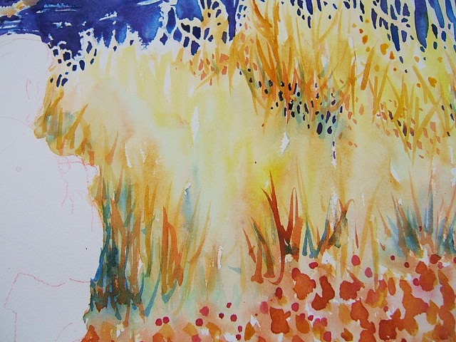
I am working on a new piece called “Invitation: To
Proceed”. There is no one photo that captures what I wish to express. Often I
will combine several photos into one image. The perspective is tricky at times;
it is much simpler with one person or two as long as they are not too far
apart. In this case I chose a lonely figure who was walking at a slightly
different angle to the one I needed. So there were two problems to solve: angle
and proportion. I decided a thumbnail sketch was in order so I could determine
whether or not he should be dressed in dark or light clothing. The sketch gave
me the tonal value and the proportion, now all I needed was the angle. With
difficult problems such as this a preliminary sketch is a must. Trying to draw
a perfect figure onto the watercolour sheet with all the necessary changes and
without making any errors comes down to wishful thinking. It is much easier to
make all the mistakes on a cheap piece of paper then using a light table I can transfer it by tracing. I cut a chunk of Mayfield to the correct size and began
to draw. Changing the angle of the shoulders, hips, legs and feet proved not to
be as challenging as I had first imagined. I am very thankful for all the hours
I put into life drawing. They put flow into my work. Life is so good.
Monday, July 28, 2014
Monday, July 21, 2014
Preserving the Light


Monday, July 14, 2014
Clean Wet Brushes


Monday, July 7, 2014
Value Trays for Watercolour
 |
| Wet into Wet |
 |
| Jar Lids |
The surprises in watercolour are what keep me intrigued. One never has complete control over this media and as I continue using it I am less inclined to aim for complete control. Serendipitous blending produces the most magical results. The trick is recognizing when to leave things alone… To help create surprises I have happened on a system of value ranging that works very well for me. Value is the foundation for all colour and is therefore the most important. In the photo "Jar Lids" above you see a fine example of recycling: jar lids holding various liquids. I love jar lids. Usually the lightest washes are in the largest lids. They are the base into which I drop stronger and contrasting colours: wet into wet. The system works with the separation of three sources of value within each colour. The biggest lid holds the palest wash in each colour. Usually the largest brush is associated with this value. The smaller lid holds a much darker wash and the smaller brush goes with that. If I need even stronger contrast I can always dip into my paint tray which has been moistened with a water spray. So I have two lids, two brushes and three values for each of the colours I choose to use within each painting. The other essential ingredients are clean water brushes large and small and paper towel. So much fun! Life is so good!
Subscribe to:
Posts (Atom)